Visualizations for Linear Training#
The following visualizations relate to the linear form of the training. The sections For Instructors and For Trainees, respectively, describe the purpose and means of manipulation with the visualizations.
For Instructors#
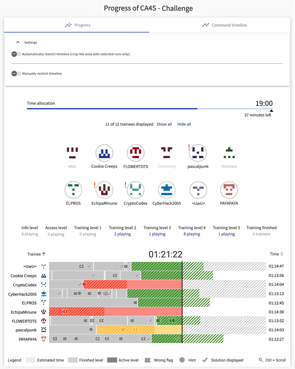
Progress of Training Instance#
As an instructor, you can see the ongoing course of the training runs and further filter information on demand in the tab Progress. This tab contains two swappable sections - Progress and Command Timeline.
Progress#
The interface consists of several sections for interaction with the visualization. Each section (see the figure below) is further described.
Info
In the visualization, exclamation marks ( ) can appear next to trainees or level tiles. They indicate a situation that may need further attention - upon a mouse-over, textual information appears. On a mouse click on the mark, it fades to signal that the issue is being solved and needs to be highlighted.
Settings
Serves for automatic or semiautomatic restriction of the full visible timeline – in case the user needs just a portion of the full progress, these settings can help observe it more efficiently.
Timeline Allocation
The time displayed in the upper right corner indicates the estimated end of the session based on the current progression. A small arrow ![]() denotes the originally scheduled end time to show the deviation from the schedule. On hover, the exact scheduled end time shows. As the training session progresses, the timeline fills accordingly.
denotes the originally scheduled end time to show the deviation from the schedule. On hover, the exact scheduled end time shows. As the training session progresses, the timeline fills accordingly.
Trainee Selection
All trainees (their avatars and/or names) are listed in the circles. Each trainee can be selected or deselected upon mouse click to show/hide their training progression in the visualization below. The mouse hovering on a visible trainee runs in the visualization highlights.
Level Selection
Tiles that represent individual training levels. Each level tile also holds information regarding the number of trainees who currently solve the level. The level type and correct answer are shown in a tooltip on hover. Additionally, the last tile displays all trainees who have already finished the whole training session. For each level, you can display its trainees on click.
Progress Visualization
It gives a full picture of the trainee’s walkthrough. Upon filtering in the preceding sections, the selected trainees are displayed here.
Each row represents an individual trainee. Bars of each row are training levels - gray levels are finished levels, current levels are colored green/yellow/red, according to their delay as opposed to the scheduled amount of time. The stripped bars denote the scheduled time for the ongoing or upcoming levels.
The bars can display the events of the trainees. When taking a hint  or submitting a wrong answer
  , the event displays in the visualization, colored the same as its level. Multiple events of the same type triggered in quick succession show as one, with a corresponding number on it. On mouse-over, detailed information tooltip shows.
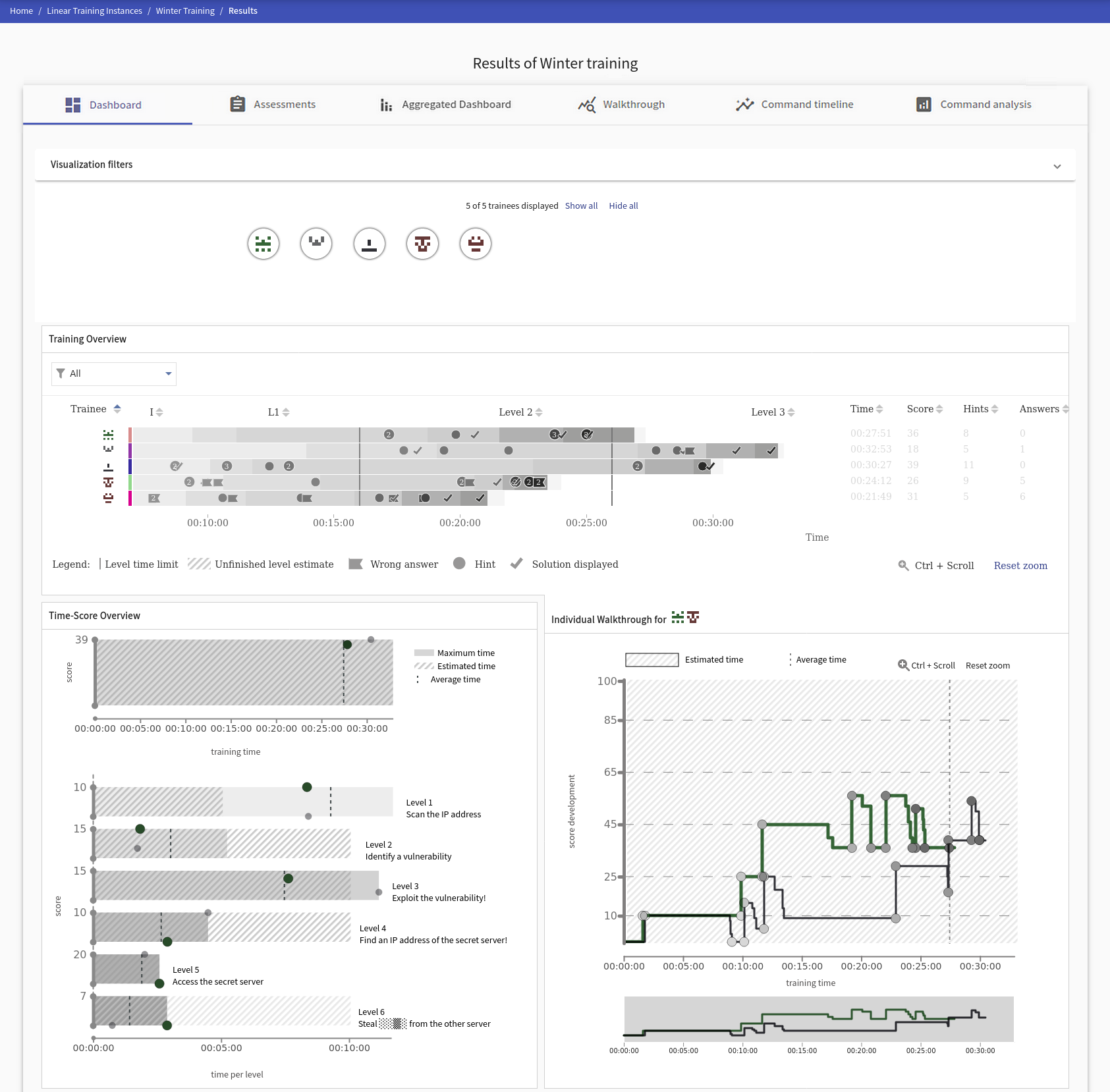
Individual Trainee Detail
More detailed individual trainee progress can be displayed. Upon clicking on a trainee avatar or name on the left side of the training runs visualization, a new window shows:
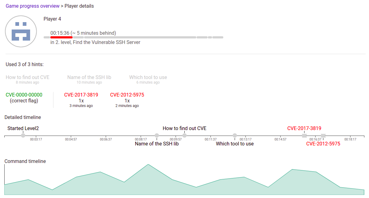
Here, the additional line chart shows the trainee’s activity for the ongoing level.
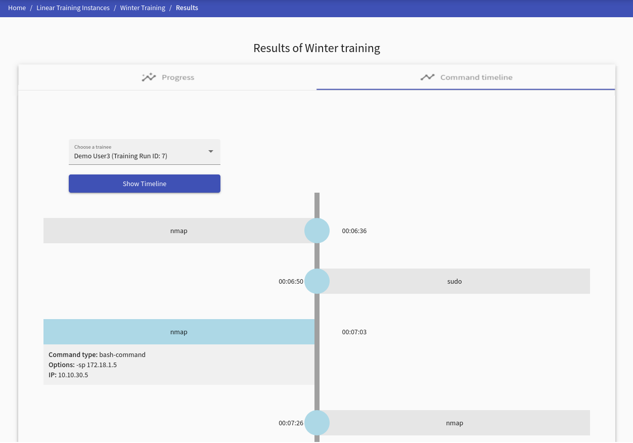
Command Timeline#
This visualization provides commands ordered by the time of the selected trainee. Every command contains the detail of its usage and when it was executed. More precisely:
- Commands Type: represents a command type, e.g., bash command.
- Options: states used option for command, e.g.,
nmap -h. - IP: IP address from which the command was entered.
Note
Displayed time is a timestamp from training, not real-time.
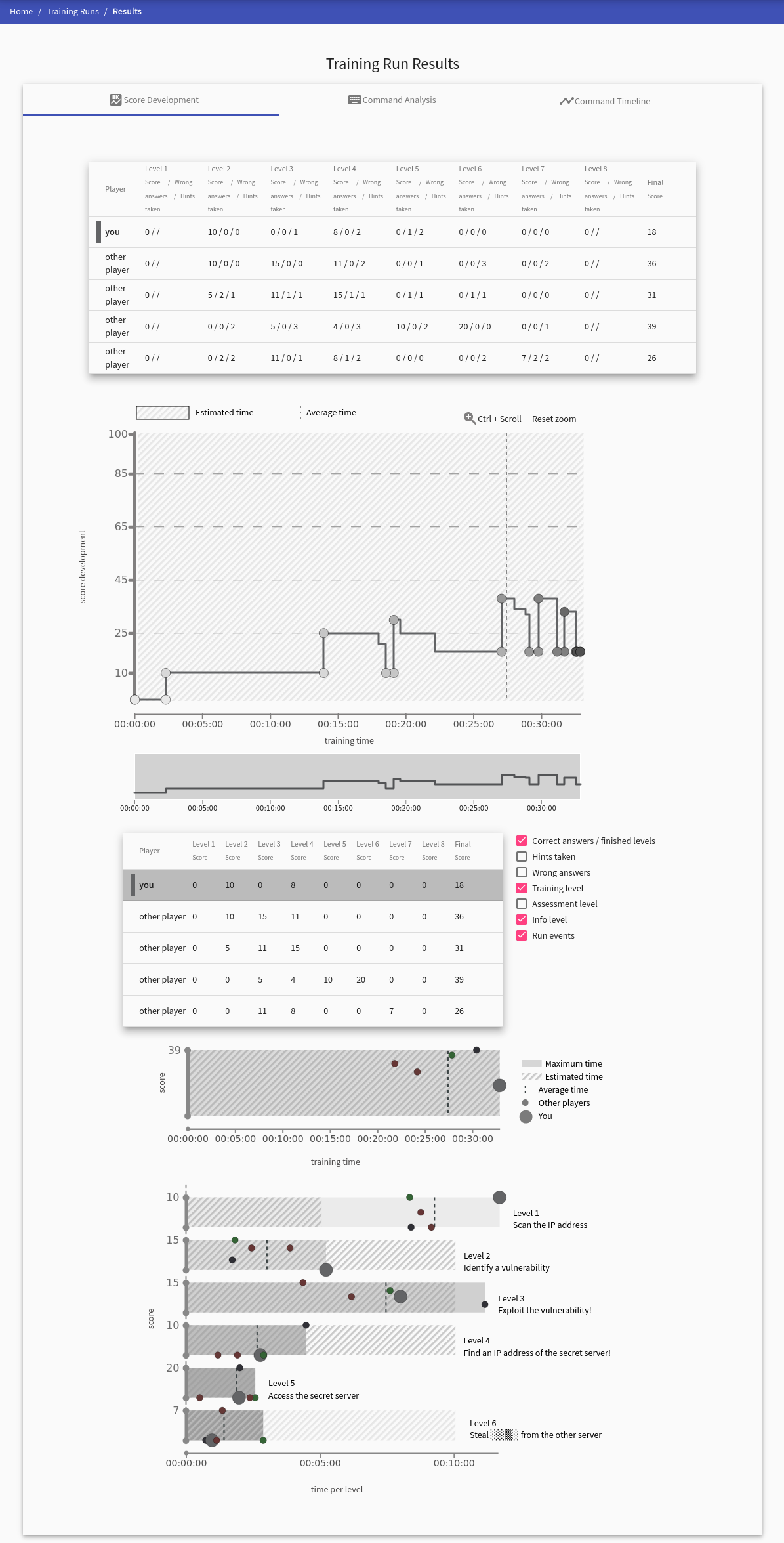
Results of Training Instance#
The page provides all collected data about the training instance in several tabs.
The Dashboard tab, which is always present, contains Score Development, Score Scatter Plot, and Progress overview graph. These graphs provide various views on trainees’ activity in training. Next to the dashboard tab is the Assessment tab. Command Analysis tab is present if any commands were collected.
Dashboard#
This visualization unites the previously listed visualizations and provides interactions between them. Visualization filters allow the instructor to filter the available training events and the format in which the trainee selector displays the trainees. The trainees selected by the trainee selector are then shown in the Progress overview graph. The instructor can filter which trainees they want to see in visualizations by this option. Their results are displayed in the progress overview graph upon selecting these trainees. Selecting trainees in the progress overview graph will appear in Score Development and Score Scatter Plot. Hovering over a trainee in any visualization will highlight them in the remaining visualizations.
Score Development#
The tab displays a graph with the time development of the trainees’ scores marked in the table under the graph. The graph also displays various types of events (denoted by a small circle). To visualize events taken by trainees, check/uncheck a checkbox displayed next to the table with participants. Hold Ctrl + Scroll while scrolling with the mouse wheel to zoom in or out.
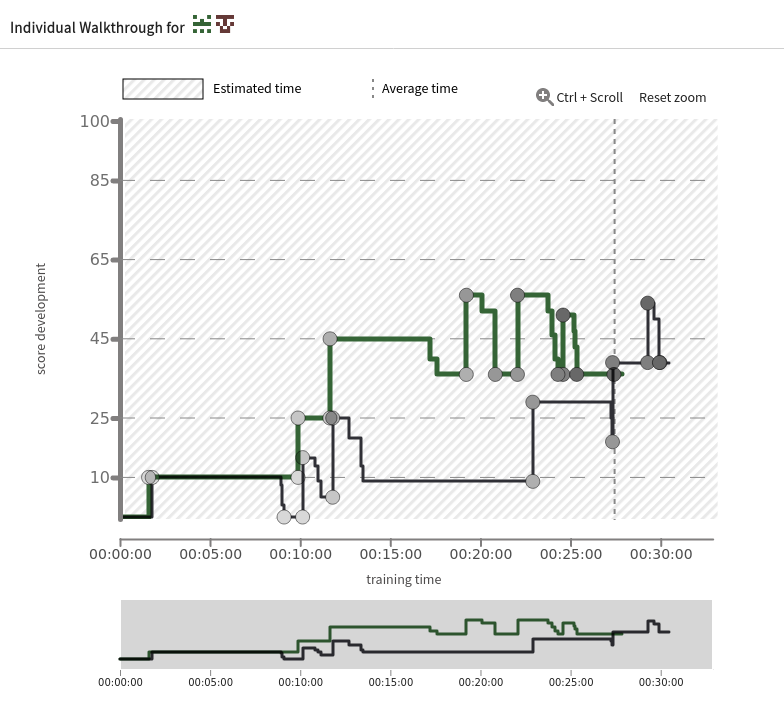
Score Scatter Plot#
This visualization provides an overview of the training results. It helps to compare the score and duration of the whole training or individual levels. Dots show the positions of the trainees based on score and time. They indicate the correlation between the two factors and help to pinpoint the outliers or allocate clusters.
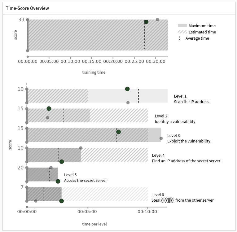
Final Training Runs View#
This visualization is a view on available data distilled from the “Progress of Training Instance”. It supports additional interaction (such as level sorting by their duration) and gives a full picture of the trainee walkthrough. The color scale helps to highlight individual levels for all trainees as well as their usage of hints or submissions of wrong answers for the levels. It helps to find skilled trainees or flaws in the training design by observing the details of its progression.
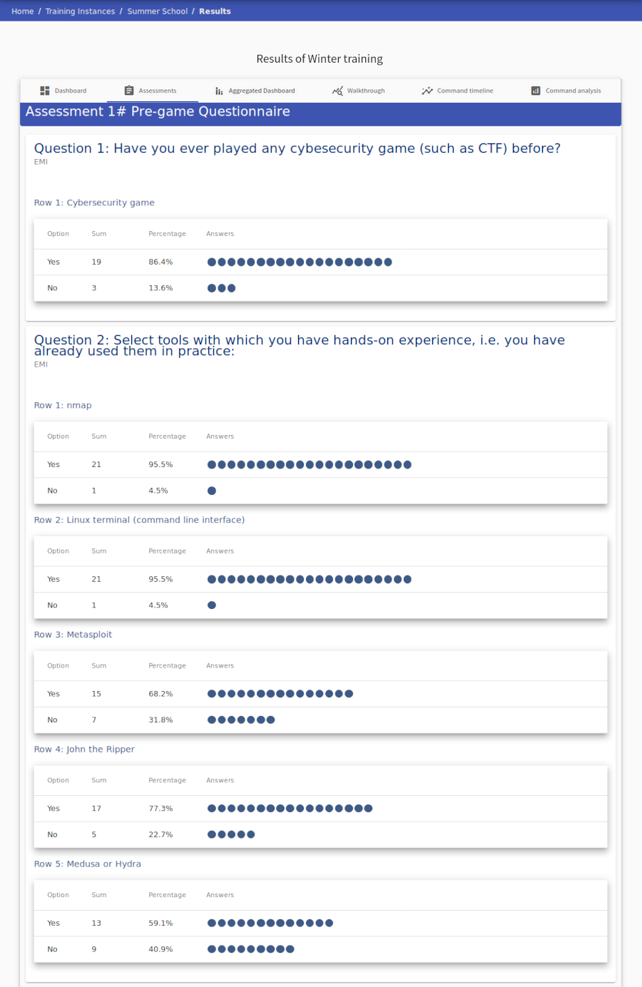
Assessment#
Displays statistics of individual assessment answers.
Aggregated Dashboard#
This dashboard provides overview over 4 different visualizations. All of these present data from selected training instances which share same Training Definition. Data from selected training instances are aggregated and presented in visualizations below.
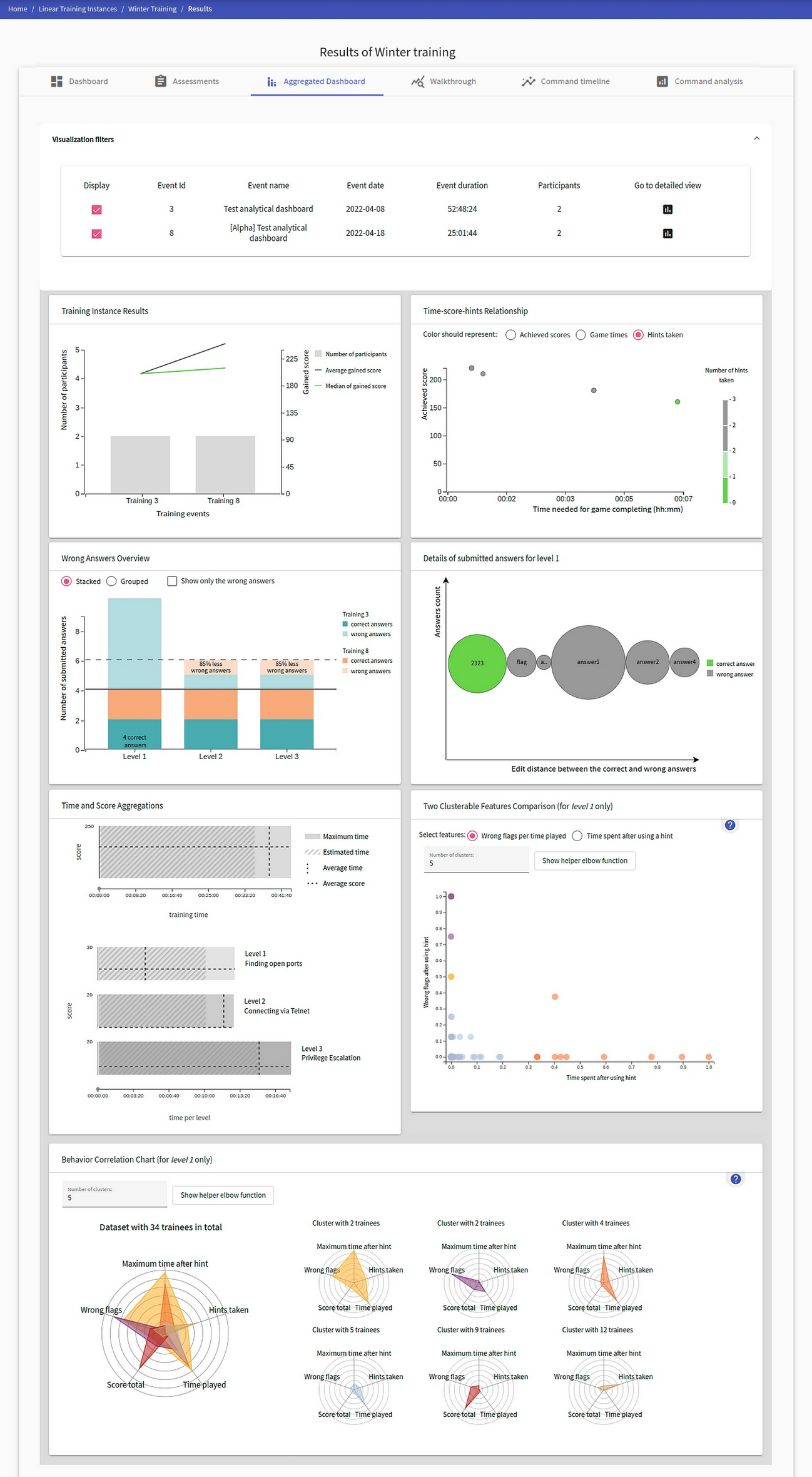
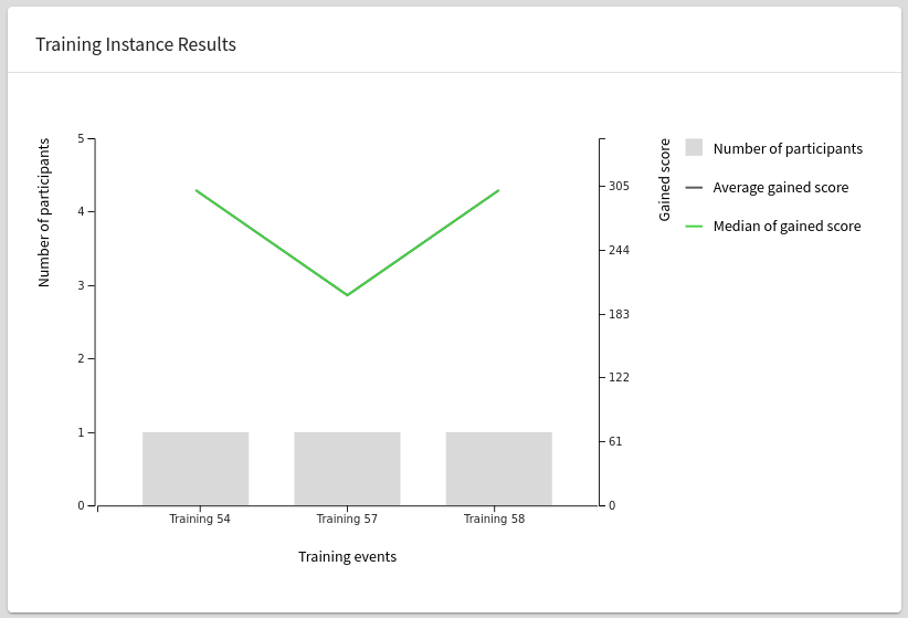
Training Instance Result visualization#
Presents statistics about obtained points and compares them across several training instances. The combined diagram contains a bar chart representing the number of participants per individual training, which is augmented by two bar graphs showing players’ average and median scores.
The visualization has a double y-ray axis. The left one corresponds to the number of training participants, while the right axis belongs to the line graphs indicating the score of participants. The x-axis represents the date when the training were organized.
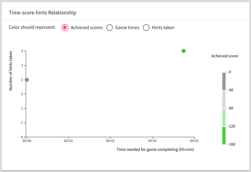
Time-score-hints Relationship#
Helps designers identify a successful game strategy - examines whether it is more appropriate to use point-based hints penalties or whether participants should prefer to solve tasks without assistance.
Furthermore, it identifies weak participants who would need help from a training instructor. Moreover, it helps to find the most qualified participants. This information helps to determine the complexity of the training.
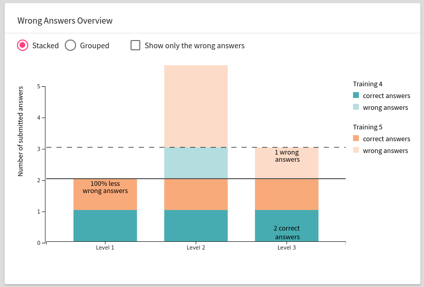
Wrong Answers Overview#
Visualization is used to analyze the quality of training, thereby helping the training designers. Provides insight into the ratio of correct and incorrect answers entered during each training level and shows whether all participants solved the level. Designers have the opportunity to compare the difficulty of training levels and identify the tasks that caused problems for participants. Significant failure can indicate ambiguities in the training definition.
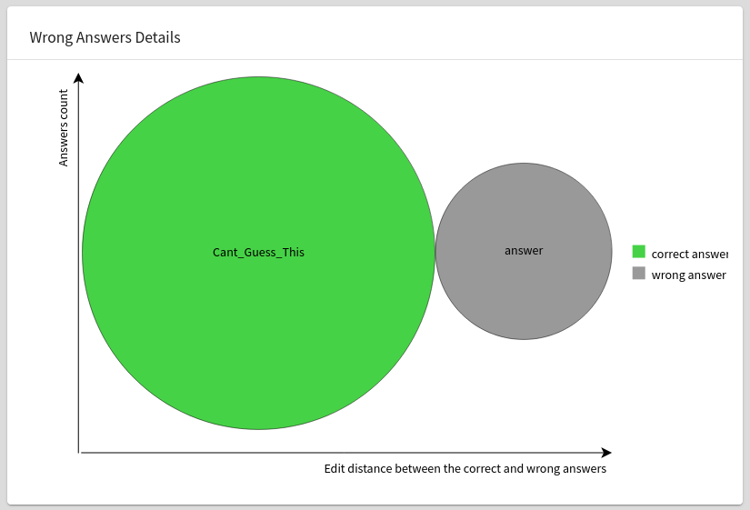
Wrong Answers Details#
The bubble chart is created for the selected training level to provide a detailed view of the submitted answers. This procedure allows instructors to examine the participants’ answers in more detail to find repeating patterns. Each bubble in the diagram corresponds to one answer entered during the currently selected training level. The bubble size indicates the number of times the participant submitted the answer during the selected training - the larger the circle, the more times the selected answer has been entered. Instructors can use this technique to identify frequently occurring incorrect answers, which in certain cases indicate ambiguity of training definition.
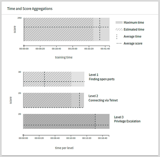
Time and Score Aggregations#
Time and Score Aggregations is an alternative to the Time-Score Overview scatter plot (see here). This view aggregates data from all the selected training instances. However, it does not display individual trainees in the form of the dots, instead it shows the maximum and average values. The maximum is marked by the size of the bars and the maximum values on the coordinates. The averages are denoted by the hatched horizontal and vertical lines.
Two Clusterable Features Comparison#
Line chart containing a radio button to swap between two line chart features:
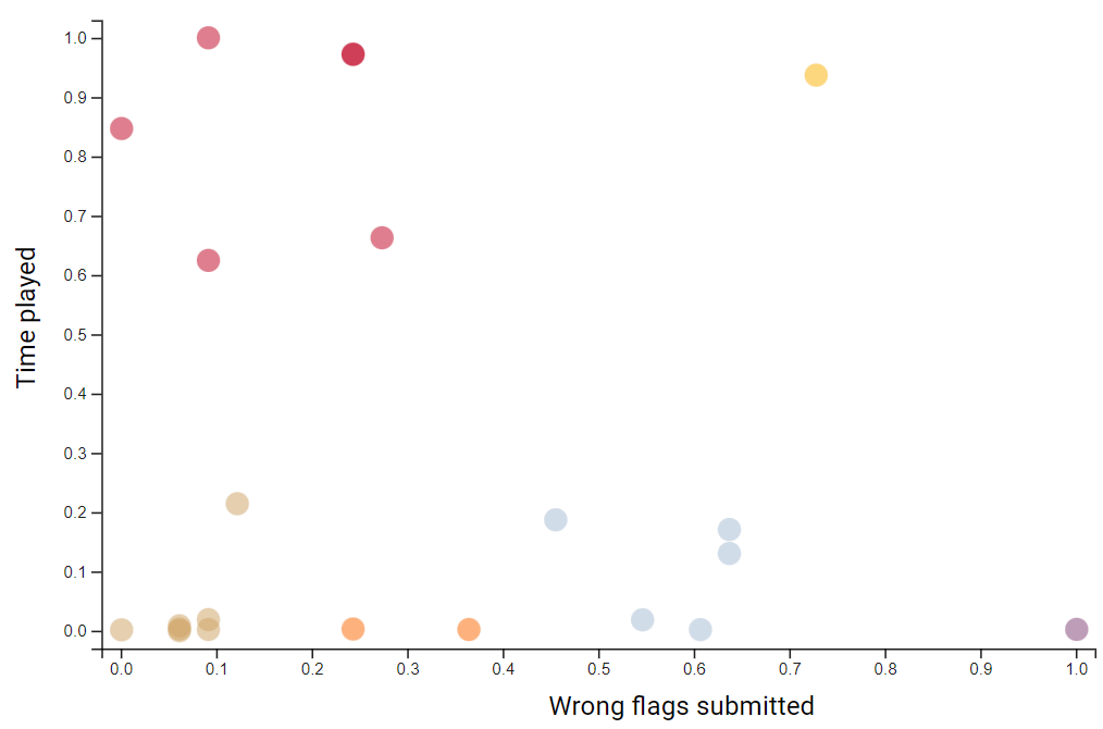
Wrong Flags Submitted#
This feature shows the scatter plot visualization of trainees submitting wrong flags per time played.
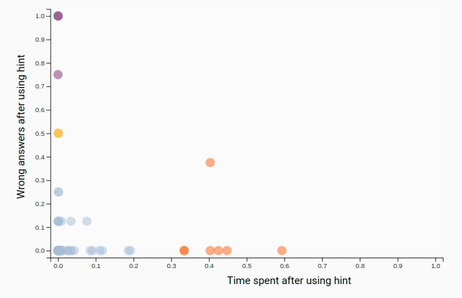
Time Spent After Using Hint#
Feature containing the information about time spent solving the current level after using a hint for the level.
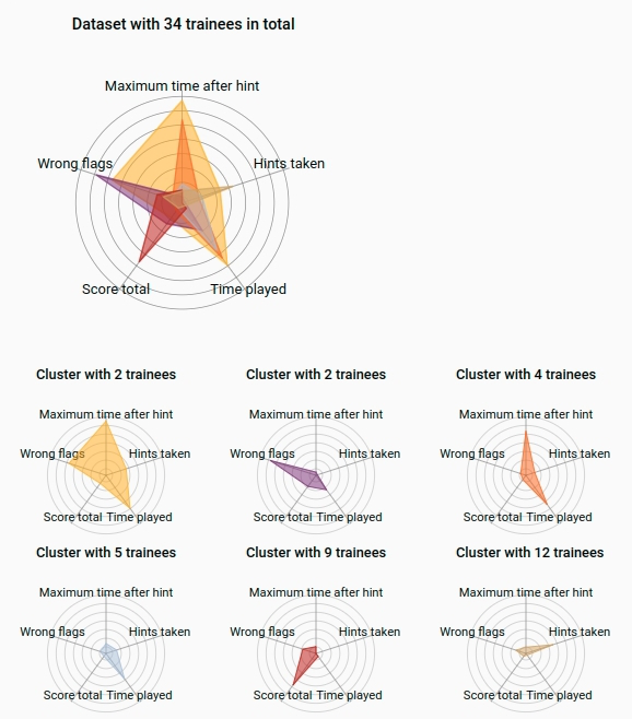
Behavior Correlation Chart#
This feature displays more complex but effectively more comparative data than the previous two aggregations. It contains radar charts for clusters of trainees based on five attributes:
- maximal time spent in a level after taking a hint
- amount of wrong flags submitted
- total score of the user
- time played
- hints taken
The biggest chart shows the correlation between all other clusters.
Walkthrough#
A tab called Walkthrough transforms the data of each game phase into visualizations that provide a quick overview of relative success rates. Each curve corresponds to one player, whose ID is shown on the far left.
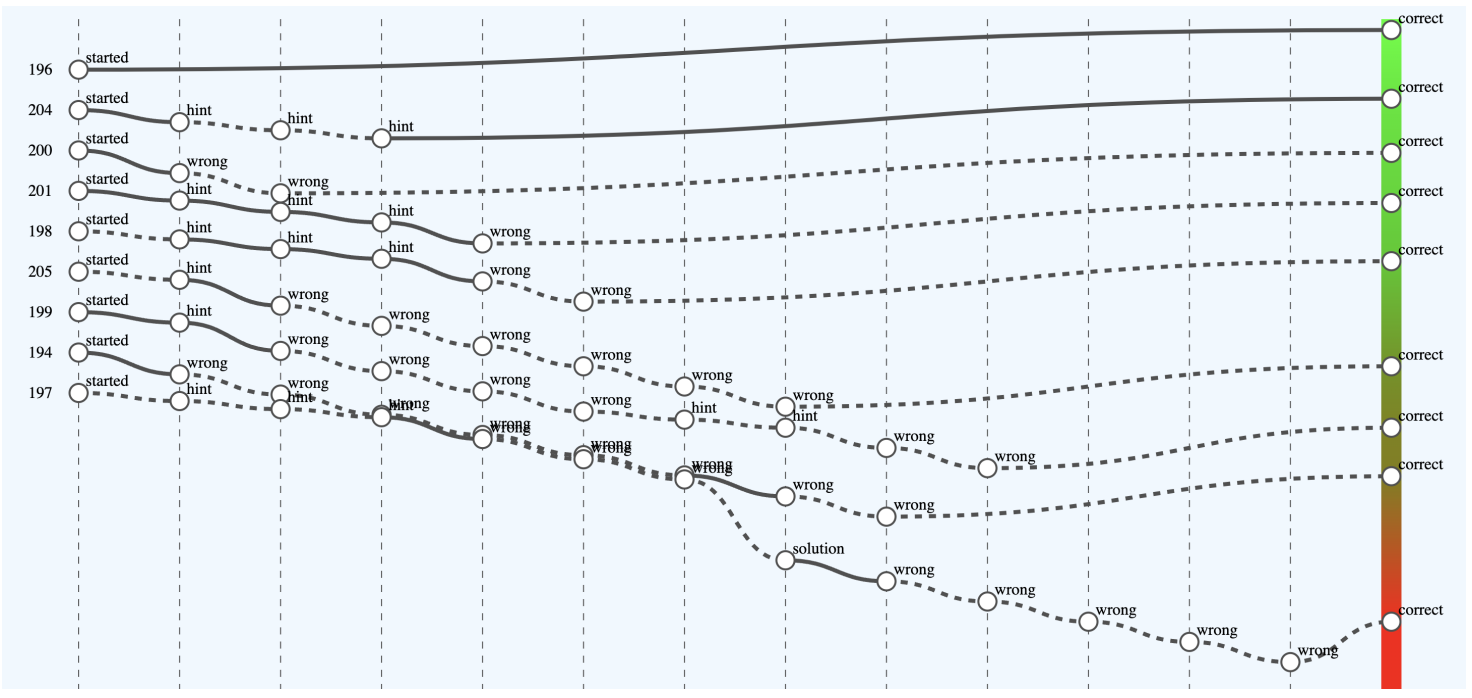
The x-axis captures important game events that are interpreted as either a successful step towards solving a task (e.g., using the correct command or entering the correct answer) or, conversely, a “failed” step (e.g., displaying a hint). This interpretation is reflected by an increasing (successful step) or decreasing tendency of the curve. Players are ranked according to the outcome. The color scale on the right visually distinguishes successful players (shades of green) from less successful players (shades of red) in this relative comparison.
For clarity, some events (points on the curves) are aggregated. When you hover over an event, details are displayed. A solid curve indicates that some sandbox commands were used between game events. Hovering the mouse over a curve will display a list of them. A dashed curve indicates that no commands were recorded between events.
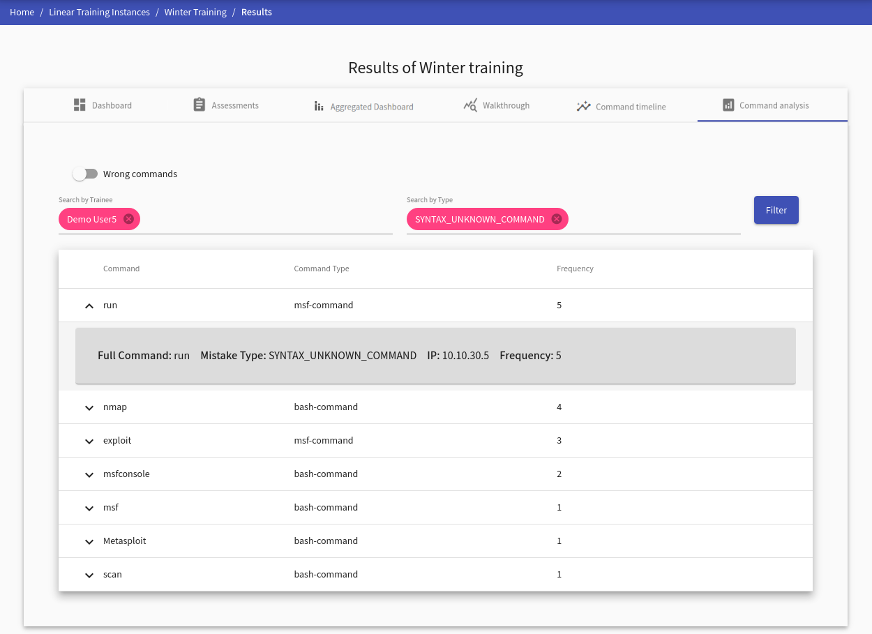
Command Analysis#
This visualization provides an analysis of commands for a selected trainee. Commands are divided by their correctness (correct, wrong) which can be changed with a slide toggle button at the top left side of the panel tab. Each command record contains the following detailed information:
- Full Command: represents the whole command with options, e.g.,
nmap -A -T4 scanme.nmap.org - IP: IP address of the machine in the sandbox from which the command has been executed
- Frequency: states the number of occurrences of this exact command
Correct Commands
Analysis of the correct commands requires choosing at least one trainee in the instructor’s view. Otherwise, the table will be empty.
Wrong Commands
Analysis of the wrong commands specifies the error type of the command. These error types are divided into seven categories based on the syntax (five categories) or semantic error (two categories). At least one error type must be selected to display the wrong commands. Also, at least one trainee must be selected in the instructor’s view.
Warning
The selection must be confirmed by the Filter button.
For trainees#
After trainees finish a training run, a set of visualizations of their behavior is displayed in tabs. Tab Score Development contains Score Development, Score Scatter Plot, and table of other trainees. Since the trainees should decode all information easily without further guidance, the interface is straightforward.
Furthermore, if there any commands collected, the following tabs are displayed: Command Analysis, Command Timeline.